-
This WAPO article outlines 10 housing records broken in 2021
- Median sales price-$386k or +24.4%
- Supply of homes-1.3mm homes down 23%
- Speed of Sales-15 days in June/July vs 39 days in 2020
- Most homes sold in two weeks or less-61.4%
- Most home sold more than ask-56.5% in June
- Mortgage rates hit all time low-30-year fixed hit 2.65%
- Record share of homes bought by investors-18.2% in 3rd Q 2021
- Second home demand doubled-+91%
- More people looked to move to a different metro area-31.5%
- Luxury home prices jumped-+25.8% to $1.025mm
I think you’re hit the nail on the head.
Developers take a lot more time to find, purchase, plan, and get approvals for a development than the actual construction. Developers around Charlotte are building as fast as they can, and it’s not fast enough. Existing home sales in our area are selling in less than two days, unless they are idiotically over-priced. Even the homes that Zillow over-paid for are selling promptly.
1 Like
I’m thinking home building and construction companies have been working “full force” over the country. Same thing Honkinggoose, is happening in my area of central/northern California.
Hard to believe in my small town, I guess there are probably 5-8 home construction projects happening at the same time. Not cheap houses! For curiosity I walked through some of the open houses. Middle range $600k.
But I’m sure folks from the Bay Area are purchasing many or most of these homes. Like you said price doesn’t seem to be a problem. As homes are completed, they are sold.
If you can work from home, no need to live in the pricey Cities. But even though I’m saying that, it’s not cheap here. 
1 Like
I was concerned that zillow would be the ibuyer canary (large), but looks like they’re the outlier. I liked the as is, but top dollar option vs dealing with actual resident buyer.
1 Like
Phoenix, Tampa, Florida, and Miami saw the highest year-over-year gains among the 20 cities in November, with increases of 32.2%, 29.0% and 26.6%, respectively.
Chicago, Minneapolis and Washington, D.C., showed the smallest annual gains, although they were all still up around 11%.
1 Like
1 Like
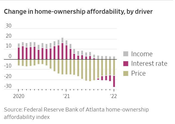
What’s the vertical scale supposed to be on that chart? Relative change in “index” from prior year?
I think they’re trying to tell you the Y/Y % change in affordability, and how much of that change was attributable to the various causes (rates, etc). Here’s the WSJ article it’s from -
3 Likes
It’s not Y/Y % change. It’s contribution to the index, and the index of < 100 means the medium home is unaffordable. Here’s the FED page:
and the more detailed chart from it (updated through January, which means it’s even worse now since the rates jumped ~2%):
2 Likes
Either way, it looks like from 2020, homes are now about 25% less affordable. That’s some serious change over a 2-year period.
I don’t think it represents a % change. It’s just a number on an “index.”
My bad, now I’ve read how the index is calculated, it’s not a % change in affordability.
Interesting that the two latest dips below 100 in affordability index were closely followed by a housing market meltdown. With interest rates climbing up quickly for mortgages, the odds of it going back up above 100 seem rather slim. And considering the looks of the Case-Shiller Home Price Index chart for the last few years (now well above the 2006 levels), that would not be surprising at all.
The measure of ‘affordability’ is all based on whether or not peoples mortgage payments are above or below 30% of their income. This really isn’t a true / false question.
Its not like can we afford to spend 29% of our income on homes but not 31%.
I think I was spending more like 35-40% of my income on my first mortgage. Yet somehow it didn’t drive me into homlessness.
Yes obviously if homes cost more they’re harder to afford. If mortgage interest rates go up then homes are harder to afford. OTOH if wages go up then homes are easier to afford.
But drawing a hard red line at 30% of income is just a number someone made up decades ago for some reason.
1 Like
That chart is through January, which means it does not reflect the recent interest rate increase from around 3% to around 5% for 30-yr fixed. The affordability is going to nosedive when that chart is updated. There’s no way incomes will catch up to it any time soon. This should put pressure on housing prices, or we could just live in a period of unaffordable housing for years.
But that much lower affordability should help reduce demand to the level where the low inventory will no longer be as huge of a problem.
That 30% was from the Brooke amendment to public housing requirements in 1969. Sure it’s outdated but there is no viable rule of thumb alternative that fits better. The 50 (housing + essentials)/30 (non-essentials)/20 (savings) isn’t great either especially as you evaluate it vs different income levels. It’s better because it bakes in some elasticity within the 50% category but it’s also harder to translate into a guideline for whether one is spending too much on housing.
2 Likes
I viable rule of thumb would be to change the # to be 50 or 60% because 30% is far too low to call “unaffordable” … today.
A lot has changed since 1969 and we havent’ changed the 30% figure.
In the 1970’s the average family spent 15-20% on housing. So in that situation sure 30% is a decent ballpark rule of thumb number for defining “unaffordable”. 1.5-2x as much as most people spend on a basic need is probably OK to call “unaffordable”
But today the average family spends 35% on housing. I don’t think we can really define “unaffordable” today to equal “less than average spending”. That don’t make sense.
In the 70’s vs today families spend just about the same amount on food, shelter and transportation combined with those 3 categores around 60%. While the % spent on housing has gone up hugely the % spent on food and transport dropped. And its certainly not due to Americans skimping on food or cars.
2 Likes
Sorry for my not being able to figure out your stats, and my ignorance of today’s families, but I don’t understand. Are you saying that families of the 70’s (pre Carter) spent about the same percentage of income as today’s (pre-Biden)? families on food, shelter, and transportation?
Yes. give or take a few %…
Also add in clothing spending which is much lower now.
1970’s :
Housing 17%
Food : 20%
Transport (cars etc) : 20%
Apparel : 8%
Today:
Housing : 35%
Food : 12%
Transport : 18%
Apparel : 2%
The cost of food and clothing vs incomes are down significantly over the decades. Transport not so different really.
Food has gotten cheaper and cheaper over time. Around WW1 people spent 46% of their money on food. Hey! Thats over 30%!! Guess that means it was “unaffordable” ? So everyone starved to death.
edit : also, the amount of income that we spend vs save or pay in taxes isn’t huge either.
70’s we spent 78% of income after taxes
Today we spend 81%
There ARE fewer people in average families now. 2.5 now vs 3.2 in the 70’s Thats part of the diff. in food and clothing spending.
edit 2 : To be clear. I know housing is less and leass easy to afford and it truely is ‘unaffordable’ for many. I’m just nitpicking that arbitrary 30% figure as the definiition.
edit 3 : ok I’ll stop editing now.
4 Likes
I think this is why the 50%/30%/20% is closer to the mark.
Housing costs increased but food and clothing decreased. If you bunch them into essentials/discretionary/savings, it’s a better benchmark. Unfortunately, that doesn’t boil down to an easy to apply number for pure housing affordability.
Maybe 30% should become 40%. 41% is what the lower income quintile spends on housing.
If you equate that income quintile to basically people living close to paycheck to paycheck, my argument is that they likely don’t have tons of fat to trim in other spending or savings. Hence if they spent more than 40% on housing, I don’t know where it’d come from.
4 Likes
Thanks for the detailed reply and equally informative edits.
Can @shinobi confirm this? ![]()
A slight nitpick – The “spend” on food and clothing vs incomes are down …
That’s not hard to believe. Have you looked at what people are wearing? I mean, if your pants are riding just above your knees, do you really need long pants? If your thong is showing above your incredibly overworked spandex, why bother with expensive, healthy food? Just throw some more DingDongs and Moon Pies in the cart while you holler on your phone that’s on full volume speaker and two feet from your ear.
… sorry, I digress.
I’m surprised that transport hasn’t dropped a lot more than 2%. With the urbanization of the country, and the supposed (not snarkey, but I don’t want to state it as fact) cost savings of mass transit, it’s odd.
Finally, isn’t that 30% figure only applicable if you are applying for the max mortgage?